Redesigned Home
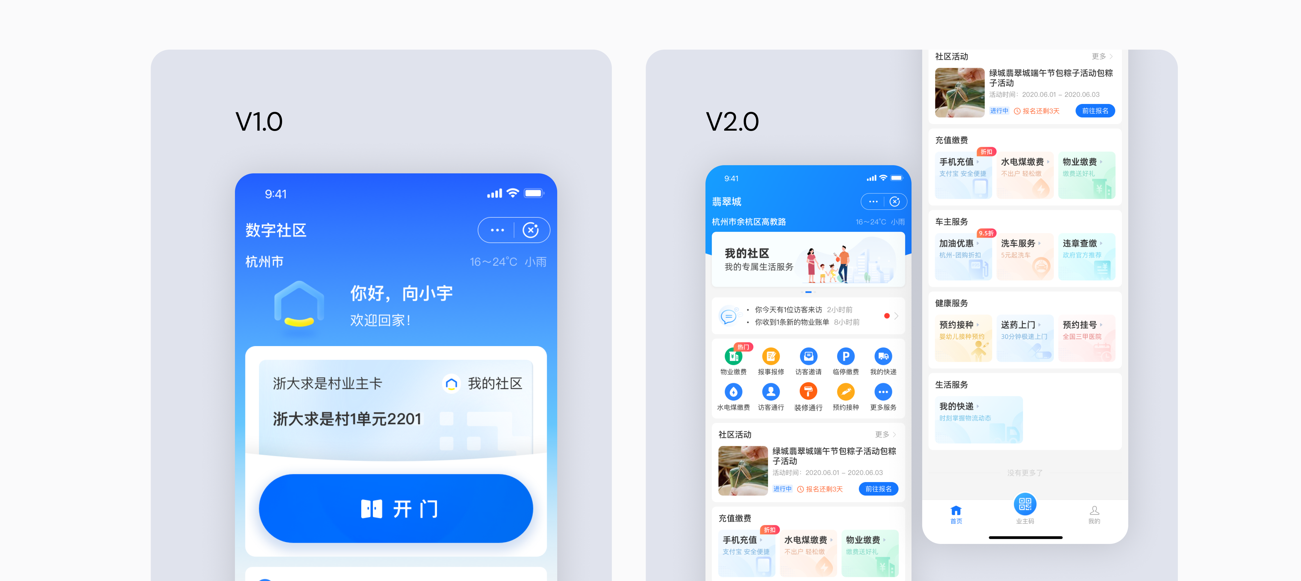
Transforming residential services into a seamless, secure, and engaging digital experience, built inside Alipay as a lightweight Mini App.
Overview
The Digital Community project was built with Alipay as a lightweight Mini App for residential communities. The goal was to streamline daily operations while improving security and meeting real resident needs. Common tasks — gate access, visitor passes, bill payment, and maintenance — are handled directly inside Alipay, with no separate app to install. The target users are property managers and residents.
The Challenge
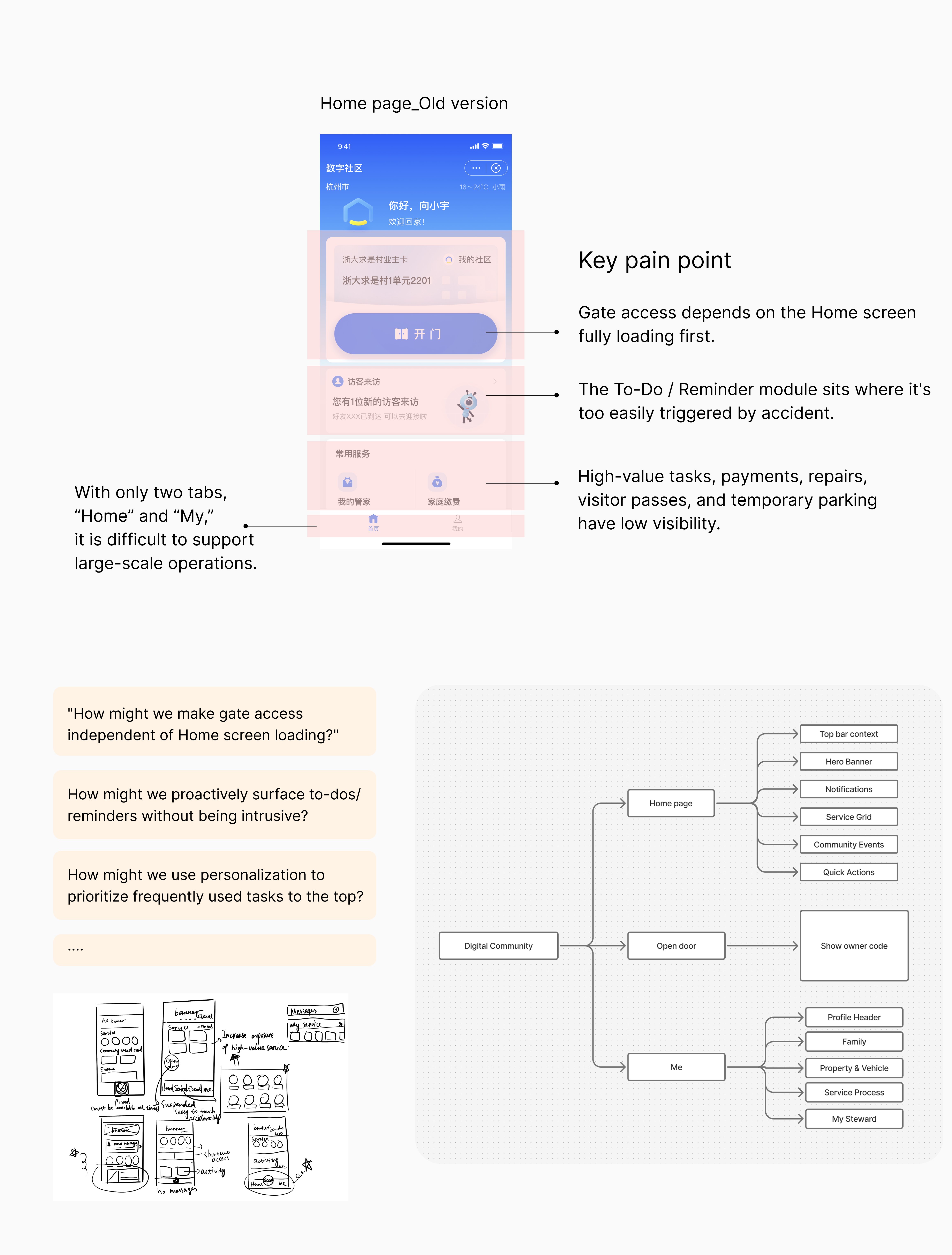
The original interface only offered basic features like e-card info and a QR code, which limited user engagement.
Without standardized design guidelines, different service modules felt disconnected, reducing brand cohesion.
Users struggled to locate key functions quickly, especially in urgent moments like visitor access or payment.
Many community services were hidden or underused due to poor information hierarchy, such as HOA services.
My Role
Led prototype and final visual design through development handover.
Established a standardized design system, consistent color, typography, and an icon set to support scalable future updates.
Collaborated closely with product and engineering to ensure seamless integration with the Alipay platform.
The Solution
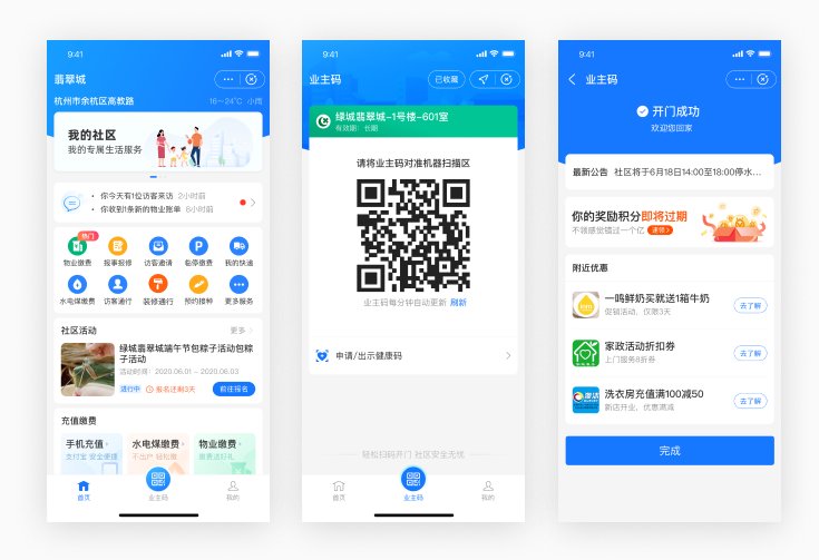
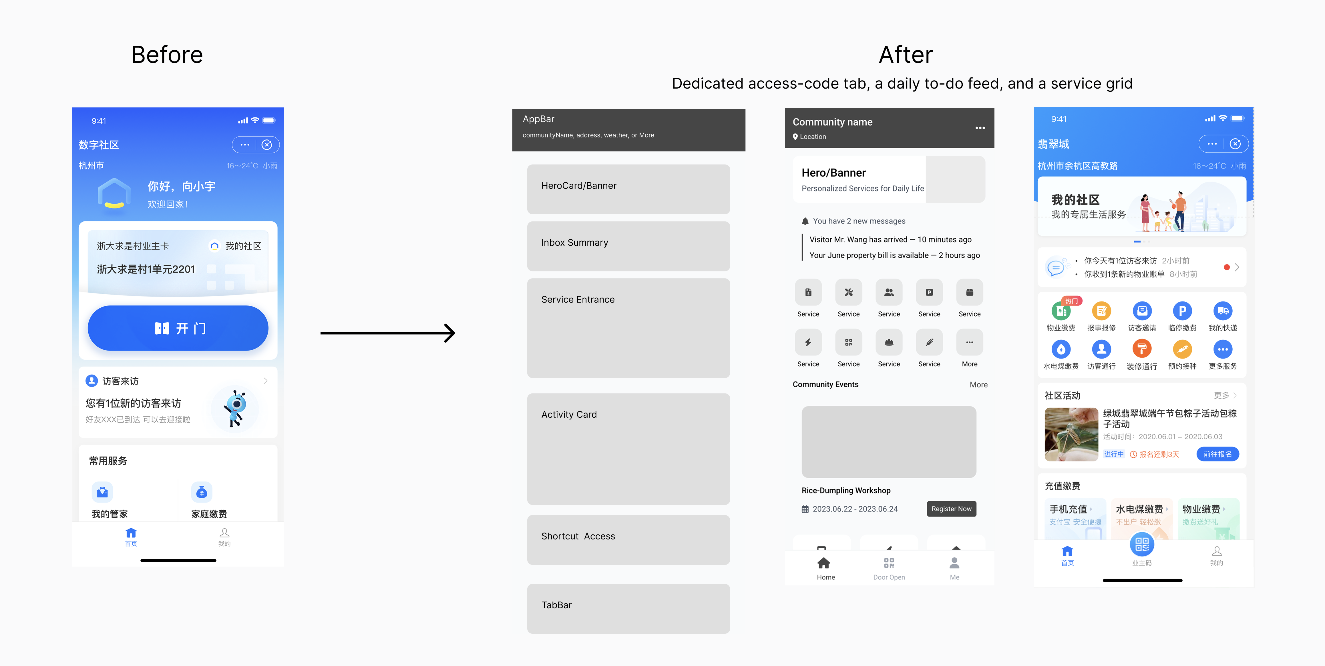
The homepage centered on a single "Open Gate" action. Everything else, payments, repairs, visitor invites, was buried or hard to find.
"Open Gate" moves to a fixed bottom tab (Access Code), while the home screen surfaces a grid of services. High-frequency action stays instant; monetizable modules become visible.
Redesigned Home
Key Scenarios
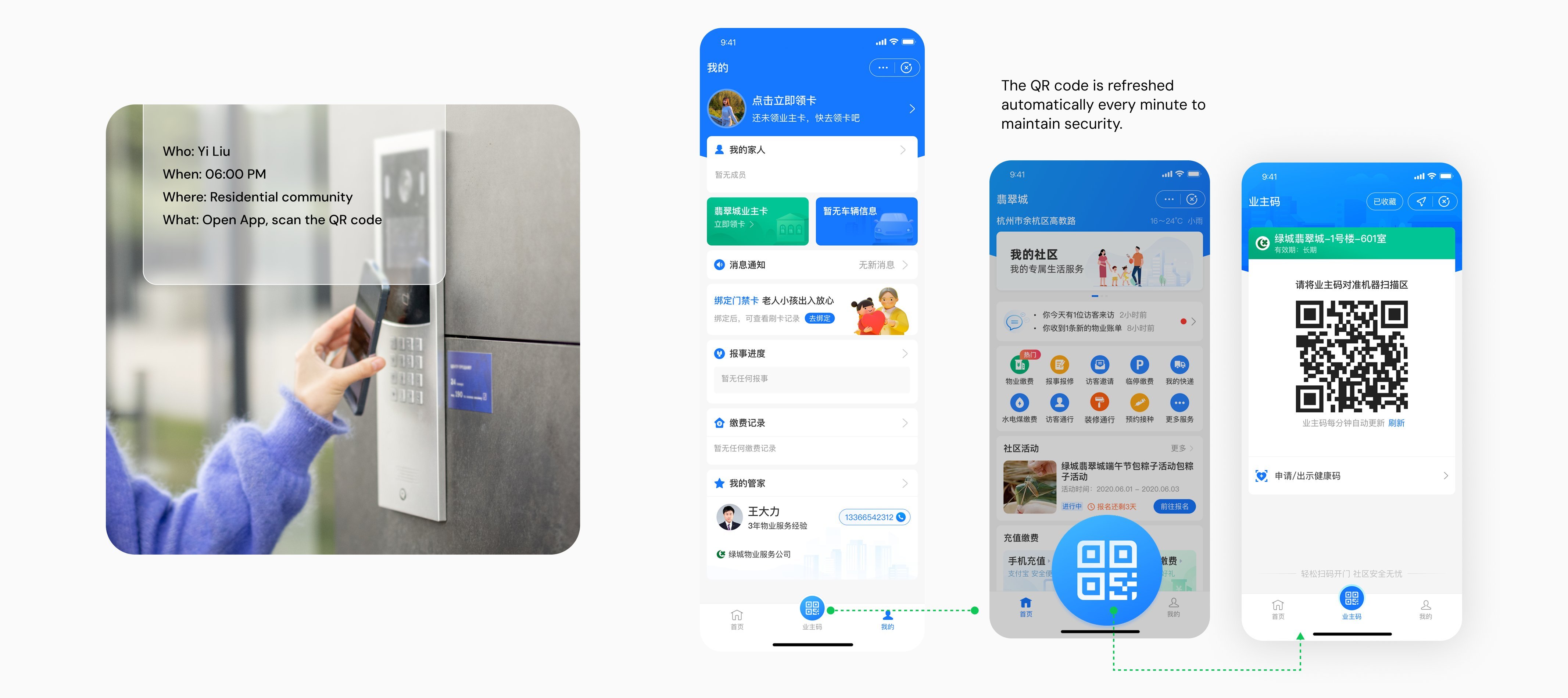
Returning home, a resident scans a QR code to enter, no physical access card to lose, and more secure than fingerprint or facial recognition. It's the highest-frequency action, so it stays just two taps away.
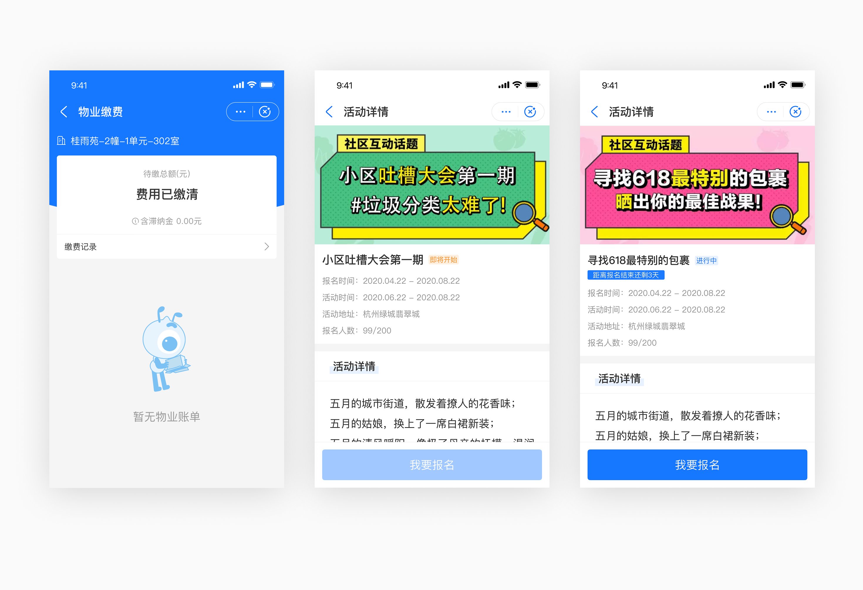
The Community Activity section gives residents a quick path to discover and join community events, building day-to-day engagement and stronger user stickiness.
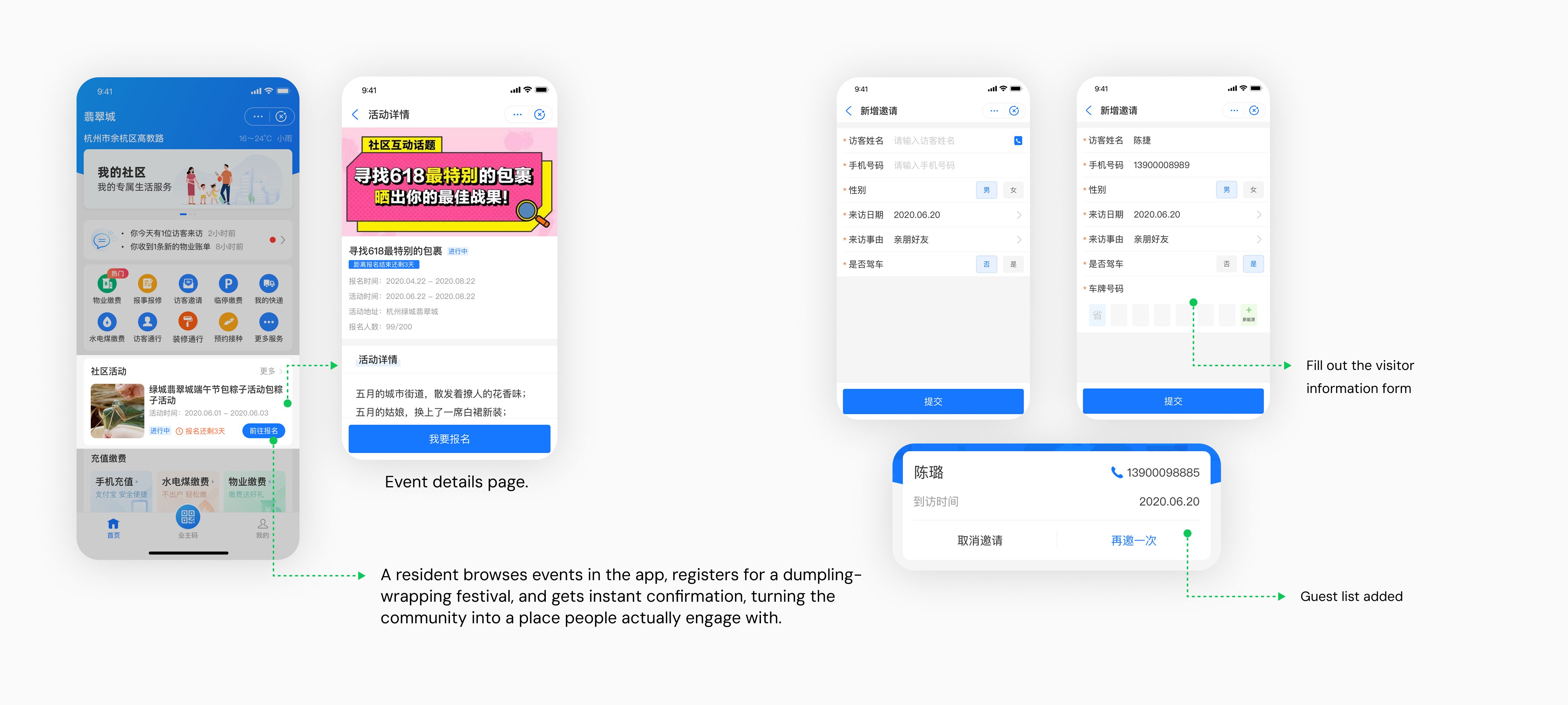
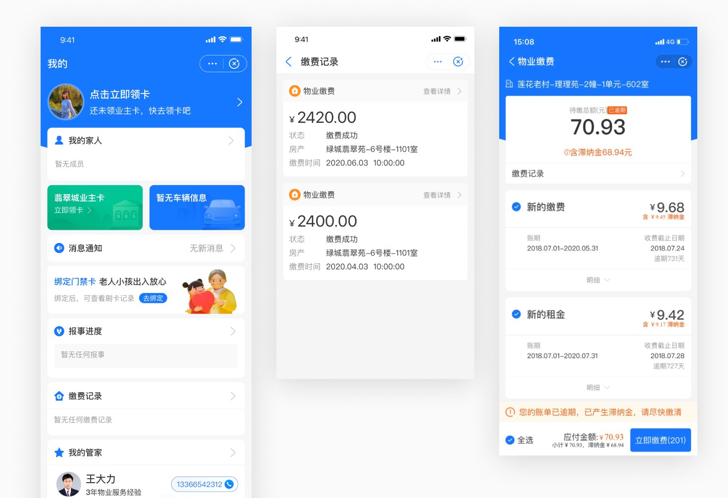
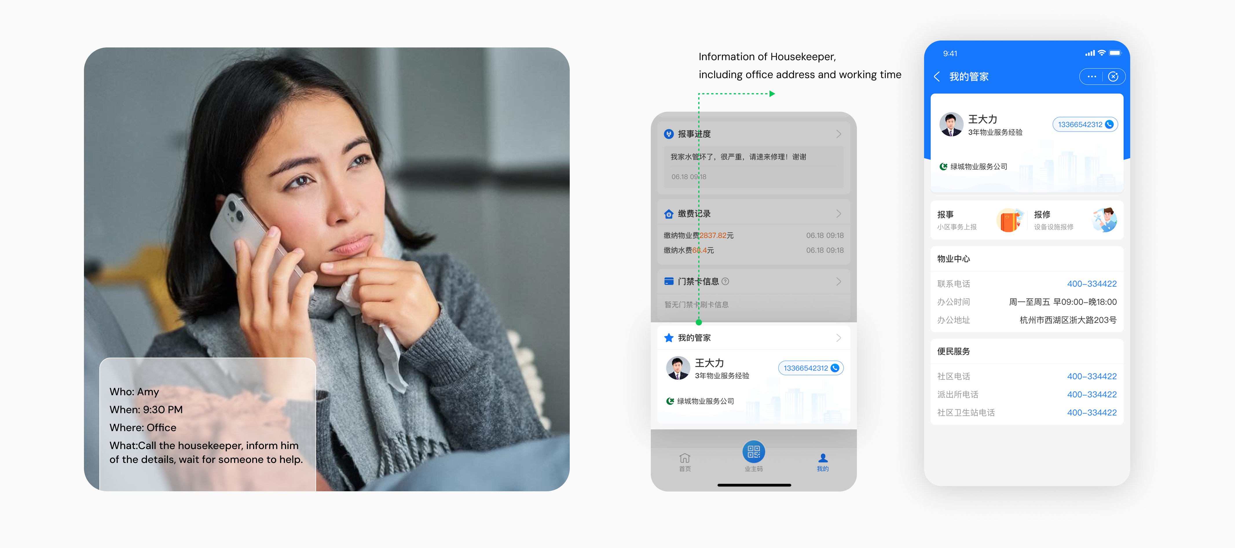
The Housekeeping Request flow lets residents reach their property manager and submit repair or service tickets in a few taps, closing the loop on daily needs and improving service efficiency and resident trust.
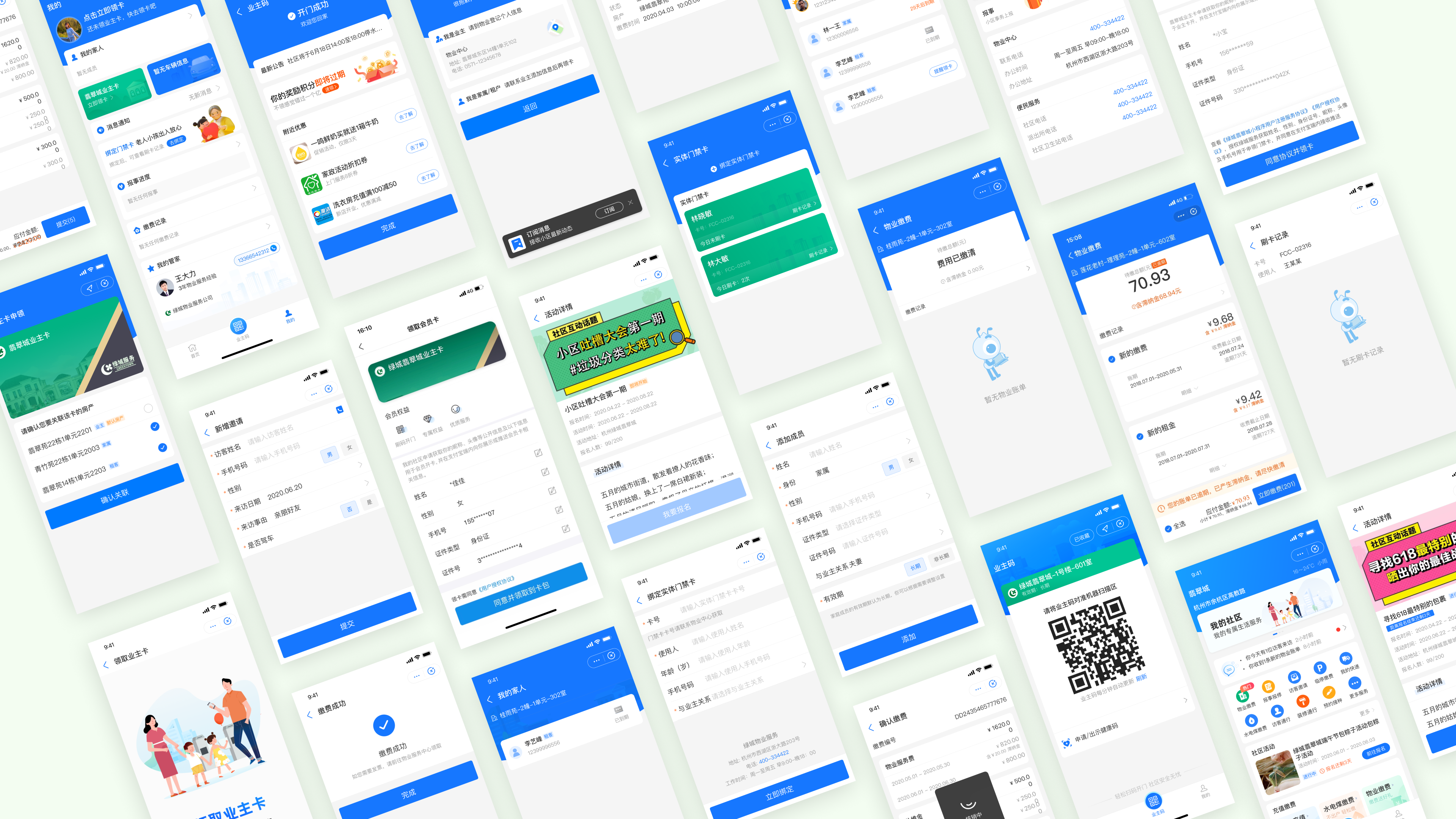
More Screens